
An operational dashboard is only useful when it turns scattered work signals into faster, better management decisions.
An operational dashboard gives a team a shared view of the work that needs attention now. Unlike a monthly report, it helps operators decide what to inspect, fix, assign, escalate, or improve while there is still time to change the outcome.
That is why the search for how to build an operational dashboard is really a search for execution design. The dashboard is the visible layer. Underneath it are workflows, owners, inputs, service levels, exceptions, and decisions. If those are weak, the dashboard becomes a prettier spreadsheet. If they are designed well, it becomes part of the operating system.
What’s in this article?
This guide covers what an operational dashboard should show, how to choose operational KPIs, how to design the workflow behind the dashboard, and where Workhint fits when the dashboard needs to connect back to real work.
Why operational dashboards matter
A good dashboard reduces the distance between seeing a problem and acting on it. Microsoft’s guidance on KPI dashboards starts with clear strategic objectives and measurable indicators. Operational dashboards need one more layer: every metric should connect to a responsible person, workflow, or decision path.
Qlik defines a KPI dashboard as a way to display key performance indicators for quick review and analysis. That review layer matters, but operations teams also need actionability. If intake volume spikes, who reroutes capacity? If cycle time increases, which step is constrained? If SLA compliance drops, what escalation path starts automatically?
Start with decisions, not charts
The fastest way to build a weak dashboard is to start by asking, “What data do we have?” A stronger question is, “What decisions does this team need to make every day or every week?” Then work backward into the signals needed to support those decisions.
For example, a customer operations team may need to rebalance workload, escalate overdue requests, add staffing coverage, or change an intake rule. A field operations team may need to see whether assignments are late because of capacity, routing, missing information, or approval delays.
How to build an operational dashboard
- Define the operating rhythm. Decide whether the dashboard supports hourly triage, daily standups, weekly reviews, or monthly improvement planning.
- Name the workflow being monitored. Be specific: client intake, vendor onboarding, contractor payments, field service assignments, content production, support escalation, hiring pipeline, or invoice approval.
- Map the stages of work. Capture the major steps from intake to completion, including handoffs, approvals, waiting states, exceptions, and rework loops.
- Choose outcome, flow, quality, and capacity metrics. A balanced dashboard shows whether work is succeeding, moving, meeting standards, and resourced properly.
- Set targets and thresholds. Use green, warning, and action states. Avoid dashboards where every number is visible but no number tells the team what to do.
- Assign metric ownership. Every important metric needs an accountable owner and a response path. If no one owns cycle time, cycle time will not improve.
- Connect the dashboard to work records. Operators should be able to click from a metric into the requests, tasks, approvals, assignments, or exceptions behind it.
- Review and prune regularly. Remove metrics that do not change decisions. Add metrics only when a repeated blind spot is costing time, quality, money, or trust.
Operational dashboard metrics to include
The right metrics depend on the workflow, but most operational dashboards need a mix of leading and lagging indicators. IBM’s operational dashboard documentation is a useful reminder that dashboards can combine KPIs with due assignments, overdue items, and quick actions.
| Metric type | What it answers | Example metrics | Operational action |
|---|---|---|---|
| Volume | How much work is entering the system? | New requests, open cases, tasks created | Add capacity, prioritize, or refine intake |
| Flow | How quickly is work moving? | Cycle time, wait time, throughput, aging work | Remove bottlenecks or rebalance work |
| Quality | Is work meeting the standard? | Error rate, rework, approval rejection rate | Improve instructions, training, or validation |
| Capacity | Can the team handle current demand? | Utilization, workload by owner, queue depth | Reassign, hire, automate, or change scope |
| Reliability | Are commitments being met? | SLA compliance, overdue work, missed handoffs | Escalate, notify, or redesign ownership |
Design the dashboard around roles
One dashboard rarely serves everyone. Executives need trend, risk, and priority signals. Operators need queues, exceptions, due dates, and next actions. Team leads need workload, blockers, aging items, and service levels.
A practical structure is three levels: an overview for leadership, a management view for team leads, and a working view for individual owners. The same system can power all three, but each view should answer a different question.
A simple operational dashboard layout
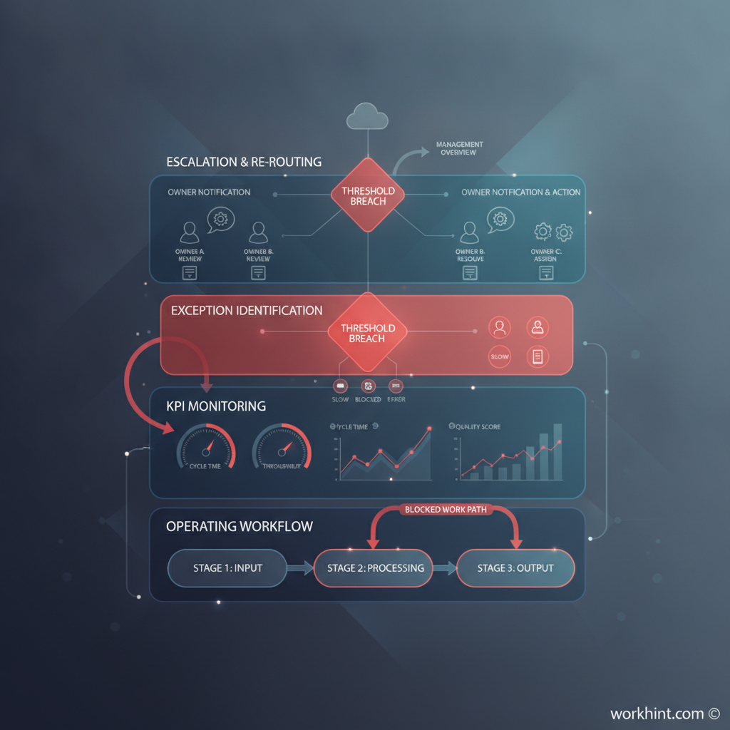
Use the top row for the few numbers that define whether the workflow is healthy: open work, overdue work, average cycle time, SLA compliance, and current capacity. Use the middle section for trends and bottlenecks: work by stage, aging by queue, rejection or rework rate, and workload by owner. Use the bottom section for action lists: overdue items, blocked work, approvals waiting, unassigned requests, and exceptions that need escalation.
That layout works because it moves from status to diagnosis to action. Geckoboard’s operations dashboard examples show how different teams adapt dashboards to IT, OKRs, safety, sustainability, inventory, and warehouse work. The common thread is not the chart type. It is the connection between the metric and the operating context.
Common operational dashboard mistakes
- Tracking too many metrics. More metrics create less focus when the team cannot tell which ones matter most.
- Measuring outputs without flow. Completed work matters, but teams also need to see aging, waiting, blocked, and rejected work.
- Ignoring ownership. A metric without an owner is unlikely to produce a behavior change.
- Using stale data. Operational dashboards need data fresh enough for the decision rhythm they support.
- Separating dashboards from workflows. If the dashboard cannot lead the team back to the work records, it becomes a monitoring layer instead of a management system.
Where Workhint fits
Workhint helps teams turn the dashboard logic into a live work system. A team can define the workflow, roles, permissions, intake forms, assignments, approvals, escalations, documents, schedules, payments, and reporting rules around the operation. The dashboard then reflects work as it moves.
That matters when operations involve multiple roles, external contributors, approvals, service commitments, or handoffs across tools. Workhint is not just where the dashboard sits. It is where the operating model behind the dashboard can be designed, automated, and measured.
FAQ
What is an operational dashboard?
An operational dashboard is a live or frequently updated view of work performance, exceptions, workload, and service levels. It helps teams manage day-to-day execution rather than simply review past performance.
What KPIs should be on an operational dashboard?
Most teams should include volume, cycle time, backlog, overdue work, SLA compliance, quality or rework, workload by owner, and blocked items. The exact KPIs should match the workflow and decisions the team needs to make.
How often should an operational dashboard update?
Update frequency should match the operating rhythm. A dispatch or support dashboard may need near-real-time data. A weekly operations review may only need daily updates. The key test is whether the data is fresh enough to act on.
What is the difference between an operational dashboard and a KPI dashboard?
A KPI dashboard can track performance at many levels. An operational dashboard is more focused on running work: queues, assignments, bottlenecks, exceptions, capacity, and service commitments.
Conclusion
The best operational dashboards are not collections of charts. They are management tools that show whether work is flowing, where it is stuck, who owns the next action, and which decisions need attention. Start with the workflow and the decisions, choose a small set of useful metrics, connect those metrics to real work records, and review the dashboard often enough to improve the system behind it.
Leave a Reply