


Control charts help operations teams see whether a process is actually improving or just moving around.
Control charts are visual tools for tracking process performance over time. Instead of reacting to every good or bad result, a team uses a control chart to separate ordinary variation from signals that something meaningful has changed.
That matters because most teams manage from snapshots. A weekly dashboard goes red, a leader asks what happened, and the team hunts for a cause. Sometimes there is one. Other times the number is moving within its normal range. A control chart helps teams decide when to investigate and when to hold steady.
What’s in this article?
- What control charts show.
- When operations teams should use them.
- How to build a simple control chart workflow.
- A practical example for service request cycle time.
- Common mistakes that lead to bad process decisions.
- Where Workhint fits when metrics need to become operating signals.
Why control charts matter for process improvement
Process improvement depends on knowing whether the system changed. Averages, targets, and month-end comparisons can hide that answer. A process may miss a target but still be stable. It may improve for two weeks and then drift back to its old pattern.
The American Society for Quality describes a control chart as a graph used to study how a process changes over time, with data plotted in time order and compared against a center line and control limits. The Deming Institute explains the practical value clearly: a stable process lets teams predict future results unless something in the process changes.
For operations leaders, that changes the management conversation. Instead of asking “Who caused this bad week?” the team asks “Is this result outside normal process behavior?” If the answer is no, the system needs improvement. If the answer is yes, the team investigates the special cause.
When to use control charts
Use control charts when you have repeated measurements from the same process over time. Good examples include request cycle time, invoice approval time, defect rate, missed SLA count, rework percentage, customer onboarding duration, backlog age, or quality review failure rate.
Control charts are less useful when the process is new, the metric definition keeps changing, or the work is not comparable from one period to the next. Before charting, agree on what is being measured, when the measurement starts, when it ends, and which records are included.
How to use control charts in operations
Start simple. Most operations teams do not need a complex statistical program to get value from control charts. They need a disciplined workflow for measuring the same process consistently and acting only when the chart gives a real signal.
- Choose one process metric. Pick a metric tied to execution quality, speed, or reliability. Avoid vanity metrics that do not trigger a decision.
- Define the measurement rule. Document the start point, end point, exclusions, and data source. A cycle-time chart is useless if every team measures cycle time differently.
- Collect data in time order. Use daily, weekly, or per-case data depending on volume. The order matters because the chart is showing process behavior over time.
- Set the baseline. Use a stable historical period before a major change. The NHS guide to run and control charts notes that teams can test whether a process change improved performance by freezing the pre-change center line and limits, then plotting post-change data against them.
- Look for signals, not noise. Investigate points outside control limits, sustained runs above or below the center line, or clear non-random patterns.
- Connect signals to action. A signal should create an owner, investigation, decision, and follow-up. A chart without operating action becomes another dashboard decoration.
A practical control chart example
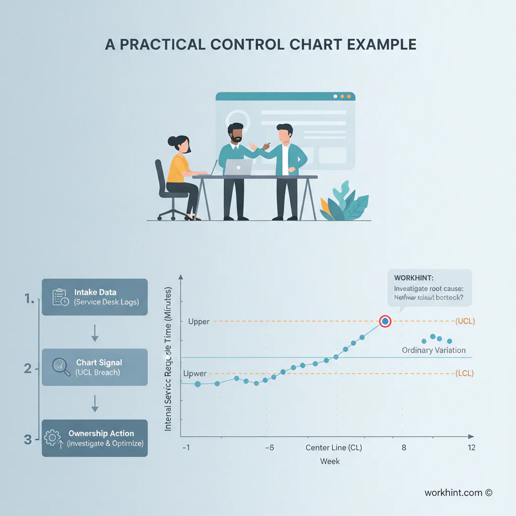
Imagine an operations team tracks internal service request cycle time. The goal is to reduce the time between request submission and completed resolution. Before redesigning the workflow, the team gathers weekly median cycle time for the previous 16 weeks.
| Metric | Process question | Signal to watch | Operational action |
|---|---|---|---|
| Median request cycle time | Is work moving faster after intake redesign? | Several weeks below the old center line | Confirm the change, update the standard workflow, keep monitoring |
| Requests older than SLA | Are aging requests becoming unusual or normal? | Point outside the upper control limit | Investigate bottleneck, assign owner, review routing rules |
| Reopened requests | Is closure quality getting worse? | Upward run over multiple periods | Audit completion evidence and requester confirmation step |
The point is to create a management rule. If cycle time moves below the old pattern after better intake fields and owner assignment, the team has evidence that the workflow improved. If one week spikes but remains inside expected variation, the team avoids overreacting.
Common control chart mistakes
The first mistake is reacting to every point. Normal variation still produces better and worse weeks. If leaders treat every movement as a crisis, teams waste time explaining noise.
The second mistake is mixing different workflows in one chart. Vendor onboarding, IT access, and facilities repairs may all be “requests,” but they may follow different rules. Chart them separately.
The third mistake is confusing control limits with targets. A target is what the business wants. Control limits describe how the process behaves. If a stable process is consistently slower than the target, the answer is redesign, not pressure.
The fourth mistake is leaving signals disconnected from ownership. Every meaningful signal should trigger a defined review path: who investigates, what evidence they collect, who decides on a change, and when the team checks whether the change worked.
Where Workhint fits
Workhint fits when a control chart needs to become part of the operating system, not a separate analytics exercise. A team can structure the workflow in Workhint so each request, approval, assignment, escalation, and completion record feeds the metric consistently.
For the service request example, Workhint can help define intake fields, owners, status rules, SLA thresholds, escalation paths, completion evidence, and dashboards around the same process. When the chart shows a signal, the team can trace it back to the request type, owner, approval step, or handoff that created the delay.
FAQ
What is a control chart?
A control chart is a time-ordered chart that shows process performance against a center line and control limits. Teams use it to identify whether variation is expected or whether a process has changed in a meaningful way.
What is the difference between a run chart and a control chart?
A run chart shows performance over time, often with a median or trend line. A control chart adds statistically derived control limits, which help teams distinguish ordinary variation from signals that deserve investigation.
What operational metrics work well in control charts?
Useful metrics include cycle time, SLA misses, defect rates, rework rates, backlog age, approval time, fulfillment time, and quality review failures. The best metric is repeatable, clearly defined, and tied to an operating decision.
How much data do you need for a control chart?
More data improves the baseline. Many teams begin with 12 to 20 time-ordered points, then refine as more data accumulates. The key is consistency: changing the metric definition halfway through weakens the chart.
Should every dashboard metric have a control chart?
No. Use control charts for metrics where process variation matters and action depends on whether the process truly changed. Some metrics are better handled with simple counts, targets, or status views.
Conclusion
Control charts help operations teams improve work without chasing noise. Choose one repeatable process metric, define it clearly, collect data in time order, establish a baseline, and act when the chart shows a meaningful signal.
The larger lesson is operational discipline. A metric should not just report what happened. It should help the team decide what to do next. When control charts are connected to workflow ownership, escalation, and follow-up, process improvement becomes measurable instead of anecdotal.
Leave a Reply