


An operational dashboard should show where work stands, where it is stuck, and who needs to act next.
An operational dashboard is a real-time control surface for active work. It is not a monthly report, a decorative KPI wall, or a place to collect every metric a team can measure. The job of an operational dashboard is narrower and more useful: help people see current demand, status, risk, capacity, ownership, and next action while the work can still be changed.
That distinction matters because many operations teams already have dashboards that fail them. They show totals, trends, and charts, but they do not answer the question managers ask every morning: what needs attention today? A useful operational dashboard turns workflow data into decisions. It should help a team prioritize, unblock, escalate, reassign, and improve the system behind the work.
What’s in this article?
- What an operational dashboard should track
- How to choose metrics that support daily execution
- A practical dashboard design model
- A table of dashboard components and operating questions
- Common mistakes that make dashboards noisy or ignored
Why an operational dashboard matters
Operations teams do not fail because they lack information. They fail when information is scattered across forms, spreadsheets, project boards, inboxes, approval tools, and status meetings. By the time the picture is assembled, the bottleneck has already slowed delivery.
Microsoft’s dashboard guidance emphasizes that a dashboard should tell a focused story on one screen and avoid clutter. Its Power BI dashboard documentation also describes dashboards as a way to monitor important metrics at a glance from multiple sources. For operations, that means the dashboard must be selective. It should not show everything; it should show the few signals that change what the team does next.
IBM’s operational dashboard documentation shows the same practical pattern in enterprise operations: monitor KPIs, see workflow assignments, complete tasks, and access related applications from the same place. That is the standard to aim for. The dashboard should connect status visibility with action, not just observation.
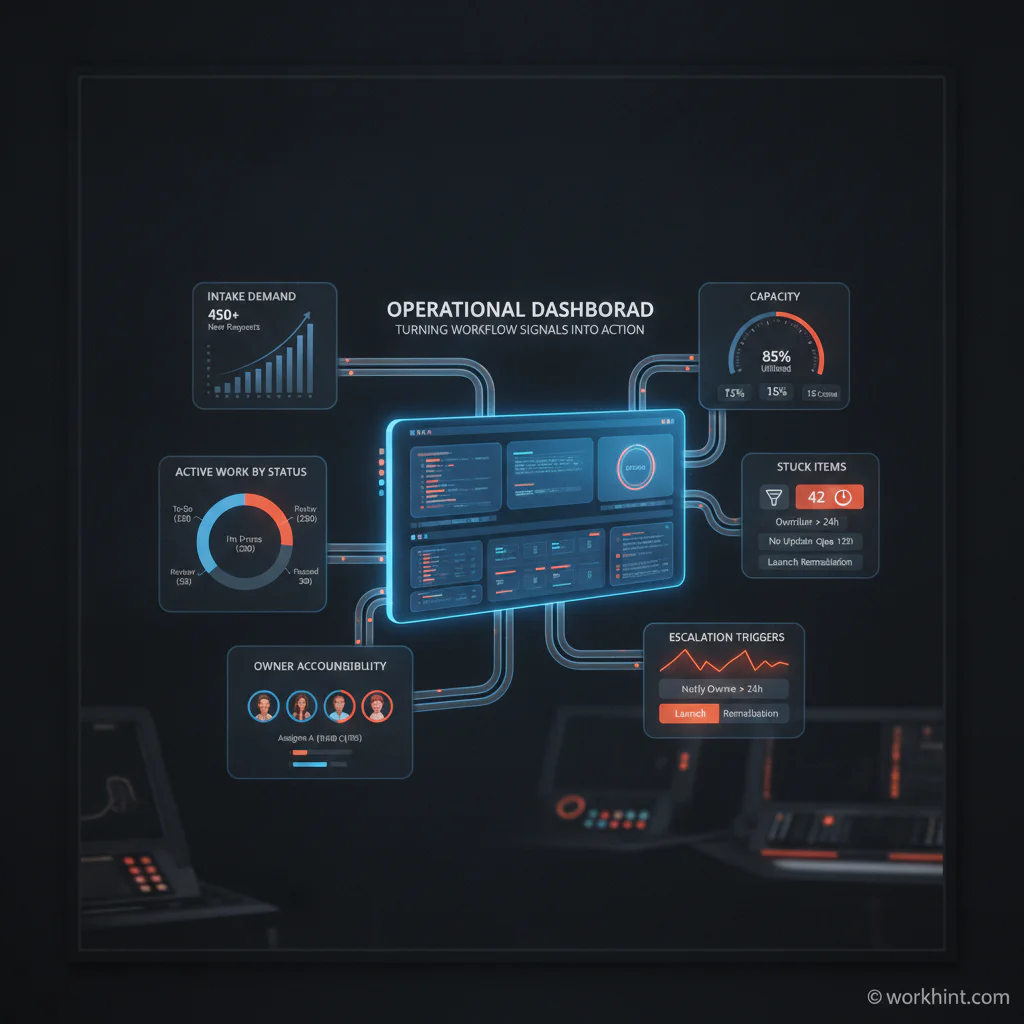
Operational dashboard design model
Start with the workflow, not the chart library. A dashboard should mirror how work actually moves from request to completion. For most business operations, that means tracking five layers.
- Demand: What new work is entering the system?
- Status: Where is each item in the workflow?
- Capacity: Who or what is overloaded?
- Risk: Which items are late, blocked, missing inputs, or near an SLA breach?
- Action: Who owns the next step?
This model keeps the dashboard operational. A revenue chart may be useful, but it does not tell an operations lead which vendor request is stuck in legal review, which customer onboarding is missing a document, or which field assignment needs reassignment before the deadline. Operational visibility comes from workflow state plus ownership.
Choose metrics that change behavior
The best operational dashboard metrics are close to the work. They help the team make a decision today. Common examples include open requests, new requests by source, items waiting for approval, average cycle time, work aging by stage, overdue tasks, SLA risk, capacity by owner, exception count, rework rate, and completed work by workflow.
Avoid metrics that are interesting but not actionable. If nobody changes a decision when the number moves, it probably belongs in an analytical report, not on the operational dashboard. Nielsen Norman Group’s dashboard guidance points out that visualizations should support fast understanding by using visual encodings people can interpret quickly. In practical terms, status, trend, and exception signals should be obvious without requiring the viewer to decode a dense chart.
| Dashboard component | Question it answers | Example signal |
|---|---|---|
| Intake queue | What new work arrived? | Requests by type, source, and priority |
| Workflow status | Where is active work now? | Items by stage, blocked items, aging work |
| Capacity view | Who is overloaded? | Work assigned by owner or role |
| Exception panel | What needs intervention? | Missing inputs, rejected approvals, SLA risk |
| Next-action queue | Who must act next? | Owner, due date, escalation path |
Build the dashboard from operating rules
A dashboard becomes useful when the team agrees what each signal means. Define the rules before you design the screen. What counts as blocked? When does an item become at risk? Which owner is accountable for each stage? Which exceptions trigger escalation? Which metrics are reviewed daily, weekly, or monthly?
Then build the dashboard around those rules. If a request waits more than two business days for approval, it should move into an escalation view. If one owner is carrying more open work than their role capacity allows, the dashboard should surface the overload before quality drops. If a workflow has repeated rework, the dashboard should show the stage where rework starts.
The Dashboard Design Patterns research project makes a useful broader point: dashboards benefit from reusable patterns that support design decisions about information, layout, interaction, and purpose. For operations teams, the most important pattern is simple: show the current state, show deviations, and show the path to action.
Common mistakes to avoid
- Tracking too many metrics: More tiles usually create less accountability. Keep the dashboard focused on active work and exceptions.
- Mixing strategic and operational views: Quarterly goals and daily workflow status should not compete for the same screen.
- Showing status without ownership: A red indicator is only useful if someone knows they own the next step.
- Ignoring workflow definitions: If teams define stages differently, the dashboard will create arguments instead of clarity.
- Failing to review it: A dashboard that is not part of the operating rhythm becomes wallpaper.
Where Workhint fits
Workhint helps teams turn an operational dashboard into part of the work system itself. Instead of manually stitching together forms, assignments, approvals, schedules, documents, status updates, and reports, a team can describe the operating process and use Workhint to structure the roles, workflow stages, permissions, intake forms, automations, escalation rules, and dashboards around it.
That matters because dashboard quality depends on system quality. If work enters through five different channels, owners are unclear, approvals happen in messages, and status is updated manually, the dashboard will always lag reality. Workhint fits when a team wants the dashboard to reflect live workflow movement, not after-the-fact reporting.
FAQ
What should an operational dashboard include?
It should include active demand, workflow status, capacity, exceptions, SLA risk, ownership, and next actions. The exact metrics should match the operating process the team manages.
How is an operational dashboard different from a KPI dashboard?
A KPI dashboard may summarize performance over time. An operational dashboard is built for current execution. It should help people decide what needs attention now.
How often should operations teams review the dashboard?
Review frequency depends on the pace of work. Daily operations may need a daily standup view, while weekly service delivery or approval workflows may only need scheduled reviews and exception alerts.
Who should own the operational dashboard?
The process owner should own it, with input from the people doing the work. Analytics or systems teams can help build it, but operations should define the decisions the dashboard supports.
Conclusion
An operational dashboard is valuable when it changes behavior. It should make active work visible, expose bottlenecks early, clarify ownership, and trigger the right next action. Start with the workflow, define the operating rules, choose only the metrics that support daily execution, and keep improving the dashboard as the system changes.
The goal is not a prettier report. The goal is a more scalable, repeatable, measurable way to run the work.
Leave a Reply